For the most part I will be talking about player character silhouettes, but just note that much of what applies to them applies to npcs and inanimate objects in games as well. So why are silhouettes so important? The simple answer is "Ease of Recognition", it lets you identify what you're looking at quickly, at greater distance than recognition via fine details (facial features, designs on the players model, etc.) and as a result, allows you to react accordingly more quickly. A good implementation of silhouette differentiation between character models also has the effect lowering breaks in a games continuity, allowing players to tell the difference between other players/npc's at a glance as opposed to needing to concentrate continually on fine details to tell who is who.
How about we just look at some examples? Below I'll look at 3 games and offer my 2 cents into their implementation of good silhouetting.
First of all, let's look at a game that doesn't really utilize silhouetting to the fullest. Actually, let's talk about an entire Genre, and that is the "World War II Shooter", realistic shooters almost as a whole tend to have problems with silhouetting simply by virtue of BEING realistic. Soldiers tend to look alike, they wear much the same gear and colors as one another, and its hard to differentiate. Though there is a spectrum to be considered even within this genre, so lets compare two games within this genre.
 |
| Pictured above, Soldier A, Soldier B, And Soldier C |
Pictured on the right is a screenshot which I am praying is from "Brothers in arms: Earned in blood" (One of my favorite WWII shooters by the way, it's amazing, go download it on steam now). And the simple fact that I have to think twice about which game this might be says something about the ease of recognition of their character models. As you can see from the picture it is very difficult to tell one soldier apart from another. And at greater distances, it not only becomes difficult to tell your allies apart from our allies, but your enemies from your allies. A Nazi looks just about the same as an american soldier once they're far enough away that you can no longer tell the difference between the drab brown of the allied forces clothing and the grey of the Nazi soldiers.
 |
| Different hats for everyone! |
So let's look at a game that does a little better job at it. Bad Company! It's necessary to differentiate the single player and multiplayer in this game, as while the single player makes displays a fairly good use of silhouetting (All of your squad mates have distinguishing features that allow you to tell them apart, even at distances), the multiplayer leaves you to decide which type of enemy you're looking at by the gun he is likely already shooting you with by the time you've figured out that its an Assault class with an assault rifle and not a spec ops with an SMG. I think the decision that companies have to make is how realistic they want their game to be. And I don't really think that there is a correct answer. The more realistic the game, the more likely it is that half of your characters are going to look nearly identical. And people who like realistic games are probably going to appreciate that. Or you could go the other direction, make the medics slighter of build, bulk up your assault classes a little bit. They're going to stand out more, and that is going to be a good thing in some peoples eyes and a bad thing in others, so it really just depends on how you're going to market the game I suppose.
 |
| All shapes and sizes! |
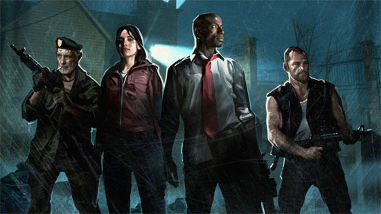
I will end with a game that excellently implements silhouetting, and it should surprise nobody that said game was developed by Valve. Just a glance at the picture shows how different each characters model is from the other, nobody ever mistakes Francis for Zoey, or Bill for Louis at a glance, which is a damn good thing because the window of opportunity between wondering if you need to shoot something and a terrible death is usually pretty short. The enemies also enjoy unique silhouettes, the common infected all share roughly the same shape and size, as they should, they are legion. But the special infected each stand out very starkly from the sea of drones, and, importantly, from one another, which is great because each special infected represents a different threat than the others, and requires a different response.
That's about all for today, sorry this post turned out so long, haha
Very interesting post. Valve indeed did a great work with L4D.
ReplyDeleteI never noticed this until Valve pointed it out in their L4D commentary
ReplyDeleteGood post. And you are right, its difficult to tell priest from mages at first glace on wow <_<
ReplyDeleteThis would have been another subtlety if not for all of those old shooters like you mentioned. I remember playing Empires: Dawn of the Modern World back in the day, and I read a review about it. One of the cons was "The soldiers all have the same face".
ReplyDeleteBut it was an RTS. And the graphics weren't that great anyway.
Still, I think this is very important but have never realized how much companies emphasize it. Look at Starcraft II. None of the units look the same.
And Diablo II, each class looked completely different, you could tell them apart within seconds.
It's interesting to think about.
Back in CS 1.3 and prior the default skins had terrible silhouettes. It was hard to tell the terrorists apart from the counter-terrorists in some lighting.
ReplyDeleteNever stopped to think about it. Nice post.
ReplyDeleteMy favorite genre (fighting games) never had problems with it. :)
I was impressed with the details valve put in their games after i purchased portal and l4d2. Also, I'm sure most folks playing wow probably turn off shadows, heh.
ReplyDeletegreat post!
ReplyDeleteI think it's odd how wow has chosen to gone with hardly recognizable classes, in many MMo's the preceded it, that was the norm. it made pvp more fluid and gave players more power. now in wow all you look for are the people holding there glowing hands in the air asking for a gank. Secondly, valve is awesome. even G man in HF had a instantly recognized silhoutte
ReplyDeleteYes, i agree. I think that 1)The physical appearance of the characters is important to how smoothly the game is played, and 2) valve does a great job of implementing it.
ReplyDeleteThis was an interesting post. Team Fortress 2 had a pretty excellent use of silhouettes.
ReplyDeleteI have to agree with John, TF2 had excellent silhouettes and so did L4D/L4D2, hell Valve just spews out greatness all the time. :PP
ReplyDeleteGreat post.
I love your attention to detail. Crysis 2 looked really good, you should check that one out as well.
ReplyDeleteDidn't even notice this before. Great post!
ReplyDeleteI still haven't played L4D2, I kind of feel like I missed that ride though :(
ReplyDeleteI always find wwII based shooters frustrating because everything looks so gray and murky and you can't tell anyone apart. I agree with you post!
ReplyDeleteInteresting stuff. I'm impressed with the level of detail in the newer games.
ReplyDeleteHey your posts are great! I'll be sharing this blog with all my game design buddies.
ReplyDelete+1 :)
And of course Valve would make one of the best fitting games .-.
ReplyDeleteGotta love them.
Followed.
Valve rocks because they get to the little things.
ReplyDeleteInterresting. Love the game!
ReplyDelete+follow
Nice post. Good info. Thanks for sharing :]
ReplyDeleteThis, a thousand times. Nothing frustrates me more than squinting through crosshairs trying to determine if I've got a bead on friend or foe.
ReplyDeleteLeft 4 Dead is definitely one that I would put on my list as well. I think that the reason the characters are so likeable is not only by their dialogue but also how defined they are by color, shape of clothing, movement and more.
ReplyDeleteGreat article, hope to see more like this!